25 WEBSITE DESIGN RULES & GUIDELINES FOR SUCCESSFUL WEBSITES

Ok… 25 Rules, Assumptions, Guidelines or Suggestions really as “rule” is such a stiff word!
One thing all web designers and developers know is that there are certain rules or guidelines that need to be followed when creating websites. I always admire the ambition and creativity of my clients with requests such as extremely large font for displaying a promotion or get emailed tiny images to use as a full background or a little Flash mouse trailer with stars. (Remember those!?)
As designers, it’s our job to step in and educate our clients on what can and should be done on websites. Of course with a little creativity and thinking outside the box, it’s always nice to push the envelope and design beyond the norm.
I really came up with this list in order to create websites that will engage the users to the max and also create the best possible conversion from viewers into clients and/or customers. In a time where search engine optimization is paramount for successful websites, many of these rules also focus on proper SEO techniques built from the ground up.
Without FURTHER DELAY HERE ARE THE 25 WEBSITE DESIGN RULES & GUIDELINES FOR SUCCESSFUL WEBSITES:
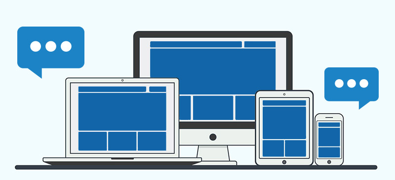
1. Respect the Mobile Environment:
I used this as my first rule as it’s quickly growing in importance. We’re seeing more and more a trend where people are accessing websites via their mobile devices not only to browse but also to complete online shopping transactions. We’re seeing more and more a trend where people don’t just “window shop” via mobile and save the real browsing for when they get home to their desktop computer. With this in mind, it’s now crucial your website is designed and structured so that all the features can be accessed via mobile.
2. Respect the Common Call to Actions (CTA):
If there’s one aspect of web design that hasn’t changed since I started is that users will always come to a website to look for a contact button and a “home” button. Whether it’s a clear “HOME / CONTACT US” link on your navigation or a little house / envelope icon, make sure it’s always clearly visible. Users actually get frustrated when they can’t find these. Also, don’t assume that everyone knows that your logo always links back to home. Although it’s been a long standing practice in web design, I still to this day (yes, in 2015) surprise people when I click on the logo to go back home! Other common CTA’s would be a cart icon for shopping /eCommerce sites.
3. Be Clear With Call To Actions:
There’s been a growing trend, especially among bloggers, where hyperlinks are randomly inserted into words in a sentence in order to give the user and additional resource or link to a website to learn more. Although these are convenient and easy to create, you’d be surprised how many people actually miss these links and therefore miss the call to action. It’s always a best practice to give the user a clear indication of what needs to happen by either creating a button or having “Click Here…” to guide them where necessary. Next time you create a blog or page, try the random hyperlink and the “click here” method to see which your users engage with the most.
4. Prompt For Scrolling:
This is a tough one to manage but it’s extremely important if you want to fully engage the user on a homepage or any other web page. When adding content to a homepage that extends beyond the height of the monitor resolution, ensure you have a visual cue such as a heading or portion of an image “prompting” the user there is more content. The last thing you want is a viewer with a screen resolution of 800×600 missing half of your homepage’s content because the next section extends beyond that 600 pixel height. Sure 800×600 is somewhat outdated and not widely used but the same applies for every resolution. This is great Segway into my next rule:
5. Study Your Client’s Analytics (traffic statistics) – Part 1:
There’s a wealth of information in an analytics package linked to a website. The standard system is now Google Analytics which tracks everything from where the user comes from (geographically) to what website referred them, whether they came from a PC or MAC or Tablet or iPhone and even how old they might be! Yes and even what screen resolution and version of Windows or Mac Operating System they were using. This is excellent information that can greatly help you shape the way your website looks.
6. Study Your Client’s Analytics – Part 2:
If your client has an eCommerce site and sells widgets and gadgets but nobody ever visits the gadgets page, don’t assume users don’t want gadgets. This could be a sign that perhaps the site is not properly optimized for gadgets and therefore, no one can find it. Site analytics can greatly help your website adapt based on your user-base. As your website builds some history, see what pages are mostly viewed, what content engages the audience and how the demographics of the user can be built-in to the website. Do you have a large demographic from Sweden? Consider adding a language option for users to see the content in their native language. Have a page with a really high exit rate? Consider reviewing the content or providing an incentive such as a coupon or discount.
4. Know Your Demographic
Adding to the above, a website for retirement homes will have a different user-base than a Justin Bieber fan page. Meaning an older demographic expects certain things like navigation, links and call to actions to be in certain places where younger people are quick to figure out a funky layout or more creative design. It’s a fair assumption that an older demographic might not have the latest computer and monitor or access websites via mobile so maybe that “screen resolution / scrolling” rule mentioned above will play a greater impact on this client’s website. Perhaps this client might not even need too much mobile optimization and the efforts can be put elsewhere such as marketing or search engine optimization.
7. Pull The Plug On Old Configurations:
I’m still shocked when I login to my statistics dashboard and see people are still using older (and unsupported) versions of browsers and even operating systems. Not only is it unsafe but it’s also reckless when it comes to properly viewing websites. I often get emails forwarded from clients saying something doesn’t work properly on their site (navigation, layout, effects etc…) my first question is always “What is your browser and your operating system”. I believe it’s our responsibility to ensure our clients (and their users) browse with the latest browsers. I will not create a patch or custom CSS for Internet Explorer 7 or Netscape 4! The case is less prominent across various operating systems (ie- Windows 95 vs. Windows 10 or Mac OSX vs. Mac OS 8) but operating systems can interpret CSS differently across various configurations. (For example font colors. sizing and pretty much everything to do with registration forms, text fields and check boxes). Just like doing cross-browser testing when creating a website, it’s also important to do cross-platform testing to ensure a consistent look.
8. Realize The Purpose Of The Footer:
The footer has become a common section to organize a wide range of information such as extended contact details, newsletter signup, social media links or commonly used links throughout your site. Just like the home or the contact us button, users now come to websites and scroll right to the bottom as this is a generalized place to put a summary of everything your site has to offer, neatly organized with links. Think of the footer like the index of an encyclopedia. You wouldn’t skim through the entire book to look for a topic. You would go to the back and alphabetically look for the pages that contain what you’re looking for. The footer is also a great place to house a mini site map for general sections of your website.
10. Use JPG Or PNG For Images:
GIF, JPG, PNG, BMP… So many image file formats. Which should you use?! Well, it really depends but let’s get a few out of the way. Forget about GIF’s (unless you’re doing those animated GIF images). I’m also not going to bother discussing the BMP file format! I cringe when I see logos created in GIF or static images on a website in this format. It simply reeks of being outdated! The 2 image files you should be using for web-related purposes should be JPG and PNG, if you need a transparent effect (for example the background of the web page bleeding through the image). There has been a growing trend to use the SVG format and I discuss this in my next “rule”.
11. Use SVG For Logos, Icons And Other Vector-Based Graphics:
We’re now accessing websites from smartphones, tablets and even televisions – all of which have different resolution requirements. A tiny iPhone 3 with a 3.5″ screen will display images differently than a website accessed on a 60″ flat screen TV. The advantage of using SVG image formats is that it can scale without losing any quality. So your logo – whether it’s a half inch big on an iPhone or 7 inches wide on a flat screen TV will have the same, clean look across all devices. The same applies for any other icons or “flat” graphics used on your website. A great source for icons and graphics we use with our clients is Font Awesome (click here to visit). Font Awesome is a CSS based toolkit that allows the use of over 500 icons as visual elements on your website. The great thing about this is they are scalable to look great across all devices!
12.Use MP3 When Uploading Sounds or Music:
I’m also going to add another “it depends” on this one as there are a lot of useful file formats for websites if you want to provide your users with lossless or high quality sound (file formats such as WAV, AIFF, OGG etc…). For the most part, sounds are usually added to websites for effects or enhancements to improve the user-experience (thing of the “cha-ching” sound when adding an item to the shopping cart). These sound bites are generally short in duration and creating these in MP3 or WAV will do just fine. It often comes down to what sound editor you have access to and for the most part, MP3 editors have risen in popularity over the last decade. Any sound that exceeds 20 seconds, the compression and file size in a WAV file will start to get heavy so MP3 is definitely the choice here. For musicians and podcasters and other audio-related needs, quite often employing a third party service like SoundCloud would be the easiest solution. Not only do they create the entire streaming interface but also provide you with various widgets to insert on your website.
13. Use PDF For Documents:
Newsletters, forms, manuals… We all need documents on our website. There are many formats to choose from when it comes to documents but the choice is clear. Always use PDF when adding documents to your website. Many designers and developers link Microsoft Word documents or even TXT files on their website and this has the potential to set off your spyware or antivirus software as a lot of harmful scripts can be embedded in a word document. Also, those mac users who don’t have Microsoft Office will actually download a file they can’t open! It wasn’t until recently that PDF documents can actually be optimized for search engine ranking with the use of PDF’s meta data so no longer will these documents be “blind” to search engines!
14. Use “Hover” And Other Mouse Effects:
Web users have gotten very picky when it comes to aesthetics and the way websites should look. Having some sort of engaging and interacting effect as the user is panning across the page with their mouse is essential so that you give your website some life. Whether it’s a simple color change of a button or underlining a link when the mouse hovers over the element, these really help the user know your website site isn’t frozen and actually works! (Again, refer to the introduction – I do not mean you should add a starry mouse trailer!!). I Also believe many of these effects such as fades, transitions help date your website in a more modern and current way.
15. Use Pop Ups!
Whaaaa? Pop Ups!? Noooo… Actually yes! Fortunately we’ve become desensitized to the dreaded popup of the past. It’s no longer that blunt Windows-like popup that stops you in your tracks and presents a tiny, cryptic message. Popups are actually a great way to engage, nudge or bring back a user’s attention to your website or towards a specific call to action. Whether offering an incentive for signing up to a newsletter or linking to a promotion on social media or offering a discount coupon right before they leave, popups can actually help convert your users into actual customers, subscribers and followers. Just make sure you give the user a clear option to close the window in case they are not interested.
16. Change Your Homepage At The Very Least Every Other Week:
This especially applies for online shopping sites and project-driven sites (like photographers, real estate agents and yes – web designers!) if you notice you have a high rate of repeat customers, you must engage with these users by providing them with new content on your homepage. Not only does it give users the impression that your website is current and always actively managed but it also improves your chances of getting multiple sales from each customers. Most online shopping systems now have “flags” (such as featured, sale items or new items) that can be used to rotate products and listings on your homepage and using a randomizing function for banners, slides and other homepage graphics can greatly improve your repeat sales and keep customers coming back. The same applies for content-driven sites. Make sure your frequently add content or provide updates through a social media feed/ticker to keep engagement high with your users.
17. Set Up Your On-Page Search Engine Optimization (SEO):
I’ll save the elaborate details of how to properly do SEO for your website for another blog but wanted to touch on a very basic and important rule when it comes to the initial design of your website. You should always design with SEO in mind as this is paramount for the success and quality ranking for your website. Many people couldn’t be bothered with the quagmire that SEO is but at the very least, on-page and on-site SEO should be considered during the design and development process. Proper page title, meta description (forget meta keywords… they don’t matter as much anymore), headings and titles, properly labelled images (for example cute-cat.jpg rather than DSC20145.jpg) image alt tags, seo-friendly URL’s (for example www.acme.com/product/nike-shoe.html rather than www.acme.com/theme/template/folder/products/485837233.html). This is a short list that will go an extremely long way in helping your SEO efforts. Quite often, many of these elements rely on a bottom-up design/development strategy that should be implemented before starting to build your website.
18. Add Social Media Widgets On Your Site:
We’re all about social media these days. People simply love to share quality content. However, people are generally lazy and simply won’t be bothered to use traditional ways of sharing content (for example – cutting and pasting a URL into email or facebook/twitter etc). To get the most benefit and having your content shared, you need the one-click approach to getting your users to push content off your site and onto their desired sharing platform. You no longer need a web developer to achieve this as there are many widgets that are easily customizable and can integrate with a simple cut and paste function right on your web pages.
19. Promote Commenting, Reviews And Ratings (Part 1):
I think this rule will make people cringe a little bit as there are always bad seeds out there like spammers and “bots” that can flood your comments/ratings sections and make it a management nightmare. Comments and Ratings are extremely important as it gives users an impartial view of your content. Imagine you walk in to your local electronics store looking to buy the latest laptop. Would you be more likely to trust the sales agent (in our case, the website/content creator) or 3-4 customers at the cash register with Model X of the laptop? Sure our clients are supposed to be expert in their field but there’s nothing more effective than having past customers do the selling for your clients. It removes that feeling of the vendor needing to push certain products or having any hidden sales agendas and provides prospective customers with a neutral and “real” review of the product/service.
20. Promote Commenting, Reviews And Ratings (Part 2):
Adding to the above, there will always be someone who doesn’t like your product, service or content. It’s inevitable that you will always receive a bad review. Before you consider deleting this review, use it as an opportunity to engage the customer and get to the bottom of the review. If it was malicious in intent, the odds are they won’t respond and you will look like you proactively tried to manage the situation. If the comments were legitimate, treat this as an opportunity to rectify the situation and perhaps learn from the process. As they say, there is no such thing as bad publicity! A great platform that can easily integrate into your website for commenting is Disqus (click here to read more). It’s simple to use with a widget-style cut and paste integration and their back-office makes it extremely easy to moderate and manage your comments.
21. Categorize Content To Keep Pages Small:
We’ve come a long way in web development when it comes to organizing content. 20 years ago you either had to create run-on pages with massive amounts of content or create a collection of pages (html files) to divide and organize your content. With advances in CSS and scripting, it’s now possible to organize your content on a single page with elements like accordion menus and toggle menus. A perfect example would be an electronics product category page. Instead of creating 20 or so pages for each category, you can have 1 page housing all your products and “flag” them to a category. Then you can let the user decide what products/categories they can see. Keeping your pages clutter free will be a lot easier on the eye and also less overwhelming. Categorizing allows the user to process content at their own pace rather than “forcing” them to see an entire page of content in order to find what they are looking for.
22. Use Headings And Graphics/Banners To Catch The User’s Attention:
People don’t really read entire websites anymore. Even on search engine results, people scan across the rankings for the keywords that are relevant to them. Google got it right by highlighting your search terms within results to help you grab a listing’s attention. The same should apply for your website. Using various headings and even graphics or banners, create catchy and easily scan-able content that will draw attention to key content on your site. Think of these similar to the grocery store signs you see that help categorize foods and save you from running up and down the aisles! These headings will also help in your SEO ranking.
23. Run The Site By Friends/Family/Colleagues Before Launch Or Delivery To The Client:
I find this step extremely useful in my development process. First of all, we all see and understand websites differently. For some, certain things might be intuitive and for others, it might not. For example I know what a “drawer” icon is (usually used for mobile devices as an indication that a menu is available) but my less tech-savvy colleague doesn’t. I know that anytime my mouse cursor turns into a hand, it means there is a link. As a developer or designer, when you’ve taken some time to create a website, you might have gotten really used to the way it works and what certain sections do. It’s important to run your creation by a fresh set of eyes to ensure your website is easy to use and doesn’t make the user scratch their heads. I once had a customer wonder where all their products were on their website and I said “under the products link in the menu”. They literally looked under the menu but couldn’t see anything. By “under” I meant in the drop-down menu located in the “Products” link! So as clear as this might be to some, for others, it might not. Going back to the “rule” above about being clear with call to actions, ensure your website is clear, functional and understandable across a wide range of people with various levels of tech-savviness.
24. Spell And Grammar Check!
I know you’ve been told by your parents, your teachers and even your boss for the last 3 decades so here I am telling you again! As superficial and irrelevant an issue this might be, spelling and grammar mistakes really tick people off! I have a client who’s an author (notice I used “who’s” and not “whose”!) and after launching his book, the emails he received were from people highlighting spelling mistakes throughout his book rather than feedback or comments on the content of his book! There is nothing worse that can lead the user off-track than seeing a mistake on your website. Sure these days text editors and even web design applications like Adobe Dreamweaver have built in spell-checking functions but remember they don’t know the difference between “rain”, “reign” or “rein”.
25. Choose Your Colors Wisely:
This is somewhat of a loose rule as quite often web designers/developers are approached with a pre-defined brand to integrate within the website. For the lucky ones who get to start from scratch be mindful on colour selection for both your brand and for the general design template of the website. Unless you’re doing a Christmas-related website, don’t use red and green. 9 out of 10 people will generally say this is a tacky color combination. When using black as the main background on a website, make sure to contrast it with a white or light grey. Any other color (especially, red, blue or green) make it extremely hard on the eye and hard to read. When using white as a base color or any other light colors, ensure you have a high enough contrast with your fonts and other design elements. As mentioned in the rule above about pulling the cord on old configurations, remember that certain colors might appear lighter or darker across different systems. So adding a light grey font (such as the popular #999999) on a white background might cause some viewers to strain their eyes to read content! (#333333 is a much nicer, non-black alternative!). As a general rule, don’t use more than 3 colors throughout your website. Blacks, greys and whites don’t really count as these are great accent colors. This is also assuming those 3 colours are colours within the main brand/logo you’re working with!